Xcel Energy® has one of the worst bill pay experiences I have encountered in a long time. First off, the actual Xcel Energy® site does not let you pay using your credit or debit card: you must go to a third party site. So what greets you when you first go to this third-party site?.
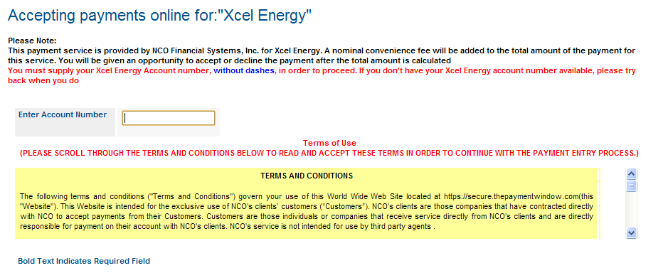
This:
 Wow. There are so many things wrong with that. The worst is that it doesn’t know your account number, and you can’t paste it from the Xcel web site because it’s in Flash. (That’s a “feature” for the DRM-lovers out there, I guess.). Also, why is “Xcel Energy” quoted?
Then there’s the liberal use of red, implying error when you haven’t done anything yet. Perhaps the oddest thing is that you must scroll to the bottom of the legalese to find the checkbox to check indicating you’ve “read” the text. Once you click the checkbox, the pages submits itself with no warning and a button appears that says “Make a Payment.” This is not reassuring wording, but you click it anyway.
So you type in your account number, and you notice the text “ You must supply your Xcel Energy Account number, without dashes, in order to proceed. If you don’t have your Xcel Energy account number available, please try back when you do.”
In any programming language worth a damn, removing the dashes rather than making the user do it should take 1 line of code. (The same is true of spaces in credit card numbers, BTW). Programmer fail! So you go back and remove the dashes – finally, the website remembers something and leaves the number with dashes in it for you to change. You hit the button with increasing rage.
But maybe now that you’ve given it your account number, it will have your information. Nope, you have to pick your state. Gee, thanks.
On the next screen, you have to enter ALL of your information. First Name, Last Name, Postal Address, phone, email. Upon entering the zip code, it now “knows” what city you’re in. Except it gets it wrong, using the “default” city for that zip code rather than the smaller city I actually live in. There’s no way to fix the information it “knows”.
Next screen, it asks for a payment amount. It has no idea what that actually is, so you have to go back to the Xcel site and copy and paste it. Oh wait, you can’t it’s Flash. Doh!
At this point if you’re like me, you say No, to hell with that. I’m using my online banking payment, which has a few issues but at least can remember who I am.

