Wi-Fi 6 is a Lie!

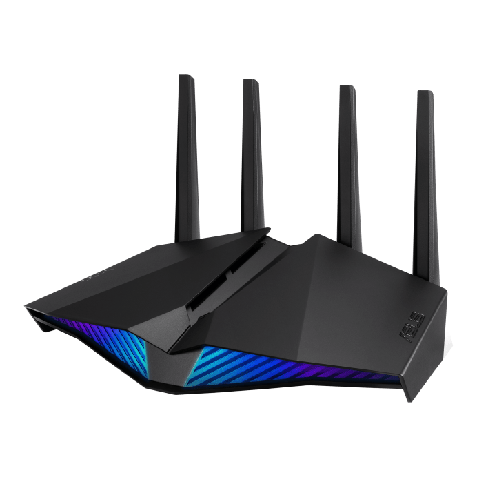
I recently bought a new router, the Asus RT-AX82U. The main feature is Wi-Fi 6, AKA, 802.11ax, which is supposed to be blazingly fast. One minor problem, the connection was flakier than a pie crust that won the state fair.

I was getting massive lag spikes on a video game. How big? Well, 1000 to 3000 milliseconds (ms). That is 1 to 3 seconds — which is not a usable connection. I was even getting lag about that bad pinging Google. I knew it was not Google.

I tried rebooting my router: nothing. I’d already updated the firmware. I’d already messed with Quality of Service (QoS) settings. My router is 15 feet from the Mac doing some of the pings, and 25 feet from the Windows gaming computer doing the other pings. Both devices were getting crappy results.

I tried moving the router farther away from a Google nest I got because I needed more microphones sending audio recordings to a completely trustworthy trillion dollar company selling me as the product. I was thinking it could be the magnets in the speakers? I was grasping at straws here. Surprise: No change.

I rebooted my cable modem and as a last ditch, desperation attempt, I  unchecked “Enable 160 MHz” based on a confusing discussion on some forum posting about whether it was worth it.

Uncheck “Enable 160 Mhz” to make your router faster and less crappy. Even though it’s supposed to make it faster.

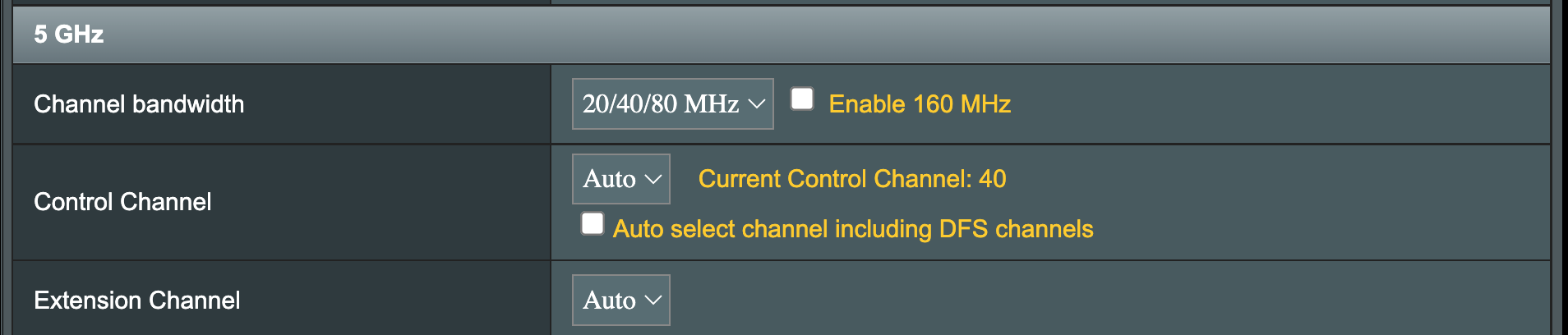
Suddenly, I was getting 10 ms pings from google instead of 1000 ms, which is two orders of magnitude better.

“Must have been cable modem reboot, I’ll turn 160 MHz back on.” I thought. So I did, and the fail immediately came back on, with lost packets and 1 to 3 second ping times. I turned it back off, and boom, stable and fast.

It’s like the Simpson’s episode where the Krusty the Clown doll keeps on trying to murder Bart, and there is an Evil/Good switch on the back? Why is 160 MHz even an option?

Image courtesy of https://frinkiac.com/caption/S04E05/439488 – I highly recommend that site

You would think I would be happy, but no.

Here’s the thing. The whole point of Wi-Fi 6 is 160 MHz.  That higher frequency is supposed to be faster. I don’t even have that many devices that support it, I was just trying to be future proof. My old router had 80 MHz already.

Because CenturyLink, I cannot get fiber where I live, so I am getting around 250Mbps download from Comcast, and 80 MHz was already comfortably faster than that.

Why did I bother to upgrade? I guess the light on the front is pretty!


Colorado DMV Site: Almost as Annoying as Going in

Registering your vehicle online, or as I explain it to my seven-year, buying a really expensive sticker, is almost as bad as going into the DMV in person.

I lucked out and my emissions were done this year. But then they randomly ask for the last eight digits instead of 6 like normal people. They make you certify everything is right, twice.

Next, you are redirected to another site to pay, always reassuring. This page has a stern warning about how you have only 30 minutes on this other site or it will time out. I should have seen that as a red flag, but I blithely continued on.

First annoyance, this site had all my itemized charges in loving detail, every nickel, every dime, but had nothing about me, not my name, not my address, nothing. So I get to fill that out all over again.

Finally, I reach the screen where I can enter my bank account number. I paste in the routing number, which is allowed and is correctly interpreted as my bank. But then they commit the original usability sin: Not allowing pasting of the account number. Seriously?  Which is more reliable, me typing a 10 digit number or me pasting it?  Oh, it’s for “security”. Right. It’s not like that myth was debunked for passwords 6 years ago.

Then I hit Next, nothing happens, I triple check the number, it is right. I turn off my adblocker and I start over again, of course it has lost my address, more typing. Still nothing.

Then I notice the scroll bar. It has scrolled a section of the page past where I have to enter the name on the bank account. Sure, it is marked in red, but I can’t SEE that as it has helpfully been scrolled out of view. Also, it should really know my name already. Here is that hidden field, after I manually scroll up like some kind of animal and enter my name.

Showing the name field which the page scrolled past

Then and only then can I get to the confirmation screen. I have to accept the terms, again. I click on the checkbox, click Next, notice it is not working. I then see the red text saying (I’m paraphrasing here) “We are pedantic jerks, we are going to make you actually scroll to the bottom of the terms, which no one does, before we will let you check the box to show that you acknowledge them.”

Then of course you get the “don’t you dare hit back or else we will charge you 19 times” popup window. I made my IQ roll on this one and cropped out the last four digits of my bank account. The sharp-eyed among you may be able to read part of those pesky terms.

Please wait popup window screenshot
Please wait, our programmers are t0o dumb to prevent double submissions

Why are government websites so head-desk levels of crap usability?

I gave the Kindle Android app 1 star and rage quit

Here’s why:

  • The See in Store buttons has failed for over two weeks as of 08/19/2014 (including the version before full screen was added).  All I get is a blank gray screen.  I call it the Gray Screen of death.
  • The button that appears when you buy a book  (I think it’s “Read Now”) has never worked.  I always have to go the Libary page and Sync to get my book.  I think it’s like those walk buttons in New York that are not connected to anything.
  • About 20% of the time, Syncing to get a book looks like it works, then, when I open the book, Kindle crashes because it wasn’t really done downloading, even though the indicator bar filled all the way up.
  • No wishlist support at all in the app
  • Twice, my app lost all access to its books and had to be re-installed before it could do anything.
  • It took six months for the full screen mode to show up on my Nexus 7. My other book reader had it almost as soon as that feature was available.
  • One click ordering is bad – I prefer the enter password every time approach.  If I didn’t lock my tablet, I’m pretty sure my 2 year old toddler would have bought some books or apps on Kindle.
  • The recommendations keep on getting worse and worse.  I get a bunch of mainstream books recommended when I’ve bought 98% science fiction and fantasy – which Amazon knows. I have to switch to the more specific recommendations tab every time – it doesn’t remember that I never buy anything.  The old layout showed the recommendations immediately, even if they were mediocre.

I’ve decided to try Google Play books for the heck of it.  Here are my initial impressions:

  • The reader is minimalist with a nice page animation
  • Page turning is much faster
  • I have not been able to figure out how to send a sample from the website, only while in the reader
  • I like full screen mode (although Kindle has this now)
  • DRM still stucks

Update the first:  I don’t like the way the Google Play books reader sometimes highlights stuff in books (like Geographical place names). Very distracting.

Update the second (08/29/2014):  You have to “pin” a book for it to stay.  This makes no sense for eBooks, which are usually less than 1 Meg, and not for a tablet with Wifi only.  It make more sense for videos.

Also, I have found some books not on Google play, and bought a Kindle book that was much cheaper (around 50%) and read it without using the Android app; recently, I was willing to pay $0.50 more for The Broken Eye by Brent Weeks to read in Google play.