Dolphins in the Arctic Sea: There’s Your Sign!

Tonight, I attended the Café Scientifique, held once a month at the Wynkoop Brewery. The speaker Prof. Jaelyn Eberle, from University of Colorado Boulder, spends her summers at nearly 80 degrees north, on Ellsmere Island, looking for fossils.  She specializes in the mammal fossils, among them hippo-like creatures called Coryphodon (said Core RIFF uh Don). The talk was engaging and Prof. Eberle passed around a few fossils as well as some muskox fur, which was cool.

The time period that Prof. Eberle studies is the hottest time period we know of, about 53 million years ago,  so hot that it had forests and liquid water way up north. Hard to believe, but holding mummified wood makes it a lot easier.

Interesting factoids:

  • Somehow, I didn’t know there had been a land bridge in the Atlantic – presumably,  from modern-day Canada to Greenland, Greenland to Iceland, Iceland to the Faroe Islands, and so on.
  • They have experienced 20 degree C weather – about 70 degrees – on their trips.  This is way warmer than usual, even for summer.
  • Last and certainly not least, one of Prof. Eberle’s Inuit contacts said they had seen dolphins.  This is nearly 80 degrees north. Wow.
  • The reason they know the island wasn’t much further south is because of paleomagnetism.  (It was only 2-3 degrees further south, if I recall correctly.)

Disclaimer: this is my recollection (and understanding) of what was said. If there’s anything wrong, it’s my fault. 🙂

Xcel Energy® Bill Pay: Monopolies don’t need usability

Xcel Energy®   has one of the worst bill pay experiences I have encountered in a long time.  First off, the actual Xcel Energy® site does not let you pay using your credit or debit card: you must go to a third party site.  So what greets you when you first go to this third-party site?.

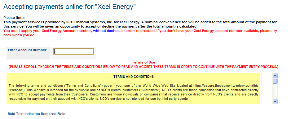
This:

Wow. There are so many things wrong with that.  The worst is that it doesn’t know your account number, and you can’t paste it from the Xcel web site because it’s in Flash. (That’s a “feature” for the DRM-lovers out there, I guess.). Also, why is “Xcel Energy” quoted?

Then there’s the liberal use of red, implying error when you haven’t done anything yet.   Perhaps the oddest thing is that you must scroll to the bottom of the legalese to find the checkbox to check indicating you’ve “read” the text.  Once you click the checkbox, the pages submits itself with no warning and a button appears that says “Make a Payment.”  This is not reassuring wording, but you click it anyway.

So you type in your account number, and you notice the text “ You must supply your Xcel Energy Account number, without dashes, in order to proceed. If you don’t have your Xcel Energy account number available, please try back when you do.”

In any programming language worth a damn, removing the dashes rather than making the user do it should take 1 line of code. (The same is true of spaces in credit card numbers, BTW). Programmer fail!  So you go back and remove the dashes – finally, the website remembers something and leaves the number with dashes in it for you to change. You hit the button with increasing rage.

But maybe now that you’ve given it your account number, it will have your information. Nope, you have to pick your state. Gee, thanks.

On the next screen, you have to enter ALL of your information. First Name, Last Name, Postal Address, phone, email.  Upon entering the zip code, it now “knows” what city you’re in.  Except it gets it wrong, using the “default” city for that zip code rather than the smaller city I actually live in. There’s no way to fix the information it “knows”.

Next screen, it asks for a payment amount. It has no idea what that actually is, so you have to go back to the Xcel site and copy and paste it.  Oh wait, you can’t it’s Flash. Doh!

At this point if you’re like me, you say No, to hell with that. I’m using my online banking payment, which has a few issues but at least can remember who I am.

Google Chrome 7

Dammit Google, fix the text-shadow bug I mentioned in my last post. Do you guys have version number envy?  Do You want to have Chrome version number higher than Internet Explorer 9?

Why am I using Google Chrome?  It’s fast as hell.  I did a cold start test – ie, right after a reboot, and it was about 3 seconds for Chrome 6, 14 seconds for Firefox in safe mode. I used the highly scientific one-one-thousand method of timing).  Safe mode means no extensions.  I also tried turning off the automatic update checks, but that didn’t help either. Chrome is also very fast and robust when you ask it do something like open 20 tabs all at once.

However, having said that, I am still using Google chrome as my default browser at home and at work.  I still use Firefox for web development (gotta have my Firebug). What can I say? Apparently, the extra 11 seconds Firefox takes to start up is in loading the text-shadow rendering.

And last, and certainly not least, it’s the browser that has the most CSS3 and HTML5 goodies to play with that isn’t from Apple.

Google Chrome 6 text-shadow is full of fail

I was upgrading Fiendish Master Plan to use HTML5 and CSS3, after being all fired up after attending An Event Apart in Washington D.C. when I encountered a major annoyance.

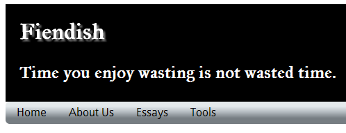
I have my custom embedded font working (IM Fell Great Primer)  and then I wanted to add a text-shadow to the site headline.  There’s only one minor problem – Google 6 chrome text-shadow handling is horribly, horribly broken.  The headline, which should read “Fiendish Master Plan,” reads “Fiendish.”  See the screen shot below.

Doh!  Apparently, it’s been a known issue since version 4 of Google Chrome.  If you use a custom font and put a text-shadow on it, hilarity ensues: some or all of the text vanishes. Talk about a glaring bug.

Come on Google, stop gratuitously ratcheting version numbers up every six weeks and fix the bug already.  For the record, I have commented out the text-shadow line for now.