Netflix: The Download Progress Bar is a Lie

Earlier this evening, I attempted to watch instant Netflix on my PS3. They been having problems lately, and on trying to watch a show, it got stuck in the middle of the download phase, clearly showing a download progress bar. I said, whatever, I’ll try back later when it’s less busy.

So here I am trying again, nearly 10:30PM local time, and it still doesn’t work. I notice that when I log in, I receive an annoying message saying I must go log in somewhere else, but logging in here seems to work. I’ve seen this before but ignored it.

I still can’t watch a show. It still gets stuck show the download progress bar. So finally I go out to the PS3 itself and re-re-login. Upon doing that it then informs me that I have to accept new Terms of Service. This is for the Playstation Network, not for Netflix. I do so, and guess what – it works fine, instantly even.

I don’t know if this is Netflix fault or Sony’s fault, but either way this is horrible usability: making it look like it’s working, showing me a download progress bar, producing a vague error message that sounds like it’s telling me to do what I just did (sign in), and making me accept Terms of Service for the second time in the last month or so.

Yes, that’s right, this happened before, just long enough for me to forget what the actual problem was. Horrible use of system status, unclear error messages, lack of memorability, they are really pulling out all the stops to violate as many usability heuristics as possible.

While I’m ranting, let me just mention that the newish PS3 Netflix client is a major downgrade. There are too many columns jammed in side by side, making it difficult to read the text. It also makes searching for a title very difficult: not all of the alphabet entry area is visible. If I had to hazard a guess as to why it’s built like that, I think they are assuming you’re on an HDTV. I’d like a downgrade to the old version, please.

Update: With the downing of the Playstation Network, I thought I’d completely lost the ability to use instant Netflix on the PS3. However, the same proceedure that failed before (trying to log in, then hitting the back button, doing this several times) works – for a while. Then you have to do it again.

Mutant Firefox 4/3.6 Hybrid Seen in the Wild

I wanted to be able to run both Firefox 3.6 and Firefox 4. Why? Because I’m a web developer, that’s why.

Screenshot of weird Firefox 4/Firefox 3.6 combination

In doing so, I have managed to create a mutant, Frankensteined Firefox 4/Firefox 3.6 hybrid. (See screenshot.) It has the new tab style, the larger back button, but is missing the big orange button and is showing the old-fashioned File, Edit, etc menu across the top.  It also does the new Firefox 4 CSS3 stuff like transitions.

The obvious solution (uninstall both 3.6 and 4, reinstall 4) did not work, possibly because I did not check the “Remove my Firefox personal data and customizations” on the uninstall for 3.6. All it did was get rid of Firefox 3.6.

So far Googling has not produced much in the way of help, but I’m going to keep banging on this and see if I can get it sorted.  Because I’m on Windows, I suspect registry editing and profile deletion with extreme prejudice may be involved. It could get ugly.

Update: No luck on getting an orange button (which I had as recently as Firefox 4 RC2), even after scrubbing the profile and Program Files directories, searching the registry for any odd information, and removing and reinstalling Firefox 4 again, As a guess, it’s a Windows XP issue, or is possibly related to my use of Songbird, which uses the Gecko rendering engine.

Update2: Problem solved! I had to figure out that the “big orange button” is called the Application Menu, or AppMenu. In brief, right click on the offending “File/Edit…” menu and uncheck Menu bar. This is probably also a good tip for those who hate the big orange Firefox button: you can also right-click on the tab bar to turn this setting back to the old-school menu.

Firefox 4, RC2 overwrites Firefox 3.6. Gee, thanks.

The Firefox betas, all 12 of them, used to nicely install alongside the production version of Firefox, version 3.6.x. When I installed Firefox 4 RC2, this is no longer the case: Firefox overwrites the old version.

So far, installing Firefox 3.6.15 to its own directory (after installing FF 4) and making a shortcut by hand seems to be working, although FF 3.6 can’t be run at the same time as FF 4: it just runs Firefox 4 again instead. Although Firefox users seem to upgrade faster than Internet Explorer users, I still have to keep an eye on Firefox 3.6 for a while. For instance, although FF 3.6 does CSS3 gradients, it does not support SVG backgrounds, which Internet Explorer 9 (IE9) does support. IE9 of course, does not support CSS3 backgrounds, but does support SVG backgrounds.

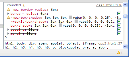
I’ve already switched my loyalties to the lightning fast Google Chrome a while ago. For a while, I was using Firefox just for Firebug, but now the Google Chrome Web Inspector is getting pretty competitive: it shows declarations it doesn’t consider valid and marks them with a little exclamation point icon, so you can see you -moz-box-shadow declarations (or even your -webkit properties where you do something silly like rgb(0,0,0,0.5) instead of rgba(0,0,0,.5). This is my new favorite mistake, by the way.

Frankly, despite some differences like the SVG versus CSS3 gradients, the whole browser area is headed in the right direction after many years of languishing in IE6 limbo, so I don’t care nearly as much whether IE9 or Firefox 4 comes out on top as I once might have. Despite the progress, there’s still going to be jobs for CSS3 and HTML wranglers: now with mobile, it makes even more sense to have someone focus entirely on the front end, even without a large team.

Speaking of which, I’m currently available to add all sorts of CSS3 and HTML5 goodness to your favorite website.

Census 2010 Data Site Has All the Latest in Fail

The 2010 data is finally starting to come out, and is available at the new website, American Factfinder, version 2.

Problems:

  1. Using Google chrome (version 9), the ability to add a geographic filter fails silently. This is incredibly annoying.
  2. Many things (including clicking on what should be normal web pages) on the website require JavaScript.  This is not fancy things like scooting data from one area of the page to another.  For some reason, this is one area where accessibility seems to be taking giant strides backwards.
  3. Once I use Firefox with JavaScript on, the filter works, and I start looking at the data. Then I receive a really irritating error message that seems to be blaming me for its random failure. This occurs several times.

So maybe I want to complain about their annoying lack of working with Google Chrome or their bogus error message.  Well, I would, except it’s a state secret who to contact about any website issues.  No webmaster email is in sight upon clicking on the tiny “Contact Us” button. After a long and fruitless search, I give up on trying to send an email.

Maybe the Census bureau folks don’t want email.  Maybe they got too much hate mail when the story broke that Census data was helpful  in rounding up Japanese Americans for placement in internment camps in World Ward II.  Whoops.  I have to say, if I were a Muslim, I wouldn’t get a real warm feeling about that whole incident and giving my information to the Census bureau.

Update: I finally found a “Feedback” button on the site. But it’s too small, and in a weird place – the top bar area where ads usually go. Feedback links should be at the bottom!