Wi-Fi 6 is a Lie!

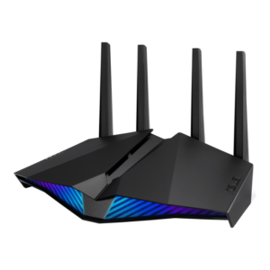
I recently bought a new router, the Asus RT-AX82U. The main feature is Wi-Fi 6, AKA, 802.11ax, which is supposed to be blazingly fast. One minor problem, the connection was flakier than a pie crust that won the state fair.

I was getting massive lag spikes on a video game. How big? Well, 1000 to 3000 milliseconds (ms). That is 1 to 3 seconds — which is not a usable connection. I was even getting lag about that bad pinging Google. I knew it was not Google.

I tried rebooting my router: nothing. I’d already updated the firmware. I’d already messed with Quality of Service (QoS) settings. My router is 15 feet from the Mac doing some of the pings, and 25 feet from the Windows gaming computer doing the other pings. Both devices were getting crappy results.

I tried moving the router farther away from a Google nest I got because I needed more microphones sending audio recordings to a completely trustworthy trillion dollar company selling me as the product. I was thinking it could be the magnets in the speakers? I was grasping at straws here. Surprise: No change.

I rebooted my cable modem and as a last ditch, desperation attempt, I  unchecked “Enable 160 MHz” based on a confusing discussion on some forum posting about whether it was worth it.

Uncheck “Enable 160 Mhz” to make your router faster and less crappy. Even though it’s supposed to make it faster.

Suddenly, I was getting 10 ms pings from google instead of 1000 ms, which is two orders of magnitude better.

“Must have been cable modem reboot, I’ll turn 160 MHz back on.” I thought. So I did, and the fail immediately came back on, with lost packets and 1 to 3 second ping times. I turned it back off, and boom, stable and fast.

It’s like the Simpson’s episode where the Krusty the Clown doll keeps on trying to murder Bart, and there is an Evil/Good switch on the back? Why is 160 MHz even an option?

Image courtesy of https://frinkiac.com/caption/S04E05/439488 – I highly recommend that site

You would think I would be happy, but no.

Here’s the thing. The whole point of Wi-Fi 6 is 160 MHz.  That higher frequency is supposed to be faster. I don’t even have that many devices that support it, I was just trying to be future proof. My old router had 80 MHz already.

Because CenturyLink, I cannot get fiber where I live, so I am getting around 250Mbps download from Comcast, and 80 MHz was already comfortably faster than that.

Why did I bother to upgrade? I guess the light on the front is pretty!


Colorado DMV Site: Almost as Annoying as Going in

Registering your vehicle online, or as I explain it to my seven-year, buying a really expensive sticker, is almost as bad as going into the DMV in person.

I lucked out and my emissions were done this year. But then they randomly ask for the last eight digits instead of 6 like normal people. They make you certify everything is right, twice.

Next, you are redirected to another site to pay, always reassuring. This page has a stern warning about how you have only 30 minutes on this other site or it will time out. I should have seen that as a red flag, but I blithely continued on.

First annoyance, this site had all my itemized charges in loving detail, every nickel, every dime, but had nothing about me, not my name, not my address, nothing. So I get to fill that out all over again.

Finally, I reach the screen where I can enter my bank account number. I paste in the routing number, which is allowed and is correctly interpreted as my bank. But then they commit the original usability sin: Not allowing pasting of the account number. Seriously?  Which is more reliable, me typing a 10 digit number or me pasting it?  Oh, it’s for “security”. Right. It’s not like that myth was debunked for passwords 6 years ago.

Then I hit Next, nothing happens, I triple check the number, it is right. I turn off my adblocker and I start over again, of course it has lost my address, more typing. Still nothing.

Then I notice the scroll bar. It has scrolled a section of the page past where I have to enter the name on the bank account. Sure, it is marked in red, but I can’t SEE that as it has helpfully been scrolled out of view. Also, it should really know my name already. Here is that hidden field, after I manually scroll up like some kind of animal and enter my name.

Showing the name field which the page scrolled past

Then and only then can I get to the confirmation screen. I have to accept the terms, again. I click on the checkbox, click Next, notice it is not working. I then see the red text saying (I’m paraphrasing here) “We are pedantic jerks, we are going to make you actually scroll to the bottom of the terms, which no one does, before we will let you check the box to show that you acknowledge them.”

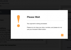
Then of course you get the “don’t you dare hit back or else we will charge you 19 times” popup window. I made my IQ roll on this one and cropped out the last four digits of my bank account. The sharp-eyed among you may be able to read part of those pesky terms.

Please wait popup window screenshot
Please wait, our programmers are t0o dumb to prevent double submissions

Why are government websites so head-desk levels of crap usability?

Zelda: Breath of the Wild: Too stingy to bother with

Spoiler Level — Mild to Medium, only for the first parts of the game.

A few nice comments before I rant

First, the few things I liked about the game in the time I played it

  • Climbing is mostly fun. Sounds odd, but it’s true
  • Gliding is also fun
  • Blowing stuff up with the bomb tool is fun
  • Moving metal stuff with the magnet tool is mostly fun, if a bit temperamental
  • Although not as pretty as a PS4 game, the graphics are mostly pleasing

But the crippling flaw of the game is that, to be different or hard-core or something, the game is stupidly stingy, in a profoundly un-fun, infuriating way. The various bad decisions made around gameplay mechanics all work together to drown out any pleasure in exploring or playing you might have.

I’ll start with the single dumbest decision in the game, the absurdly short weapon durability.

Crumbly Weapons are Crumbly

  • Weapons break after something like 20 hits, even the metal ones, even things like bows that make no sense. A wood pickax in Minecraft banging on stone has like 4 times the durability of a steel sword in Zelda. Yes, the crumbly weapons are going to be a theme. I swear some kid has made a sand castle with higher durability than a Zelda tree branch
  • When a weapon does break, you are not auto-switched to the next one, you have to stop in the middle of a fight and pick one. Or fight with your bare hands, that doesn’t work so well.
  • The inventory system starts you out with a  set number of  sticks,  swords, so when your gear breaks constantly, you will run out of good swords that you had to pass up and end up trying to beat a strong enemies with a stick.  Or you may end up hoarding good weapons and making fights take longer than they should. Or you will have to backtrack to where you thought there was a good weapon you could not pick up and you will get lost. Speaking of getting lost….

Other Game Play Stinginess

  • Exploring does not fill in the map, you have to climb towers, guarded by powerful enemies called guardians. The starting tower is handed to you, but you have to get the others. So you’re lost all the time.
  • The only quick travel is to shrines, villages don’t have quick travel. Sometime the shrines are close to a village sometimes not
  • What you can buy in villages is expensive, and the drops don’t make up for it, I ended up selling food and rare ingredients to have cash to sleep in an inn (which does restore your health)
  • Resting at a fire is free, but resting at a fire does not restore your health. Also fires (campfires) are not that common
  • You might want to rest anyway, because at night random skeletons pop up and make you break your weapons.
  • You have to solve 4 shrines (mini puzzle dungeons that reward an orb or a skill, or both) for one extra heart (health)
  • Speaking of hearts, you start out with a stingy 3
  • The skeletons and other random baddies are super easy, and the guardians nearly one shot you, there are no medium-easy bad guys, at least in the start of the game. If it weren’t for the stupid “tower” to show the map decision, the guardians being so overpowered relative to your tiny 3 or 4 hearts might not be such a problem

Cold is way overpowered! It would kill Bear Grylls!

  • In cold areas, you freeze very quickly, after about 30 seconds (not a typo!) 
  • In the beginning or tutorial area, you must beat 2 shrines in a cold area to leave the tutorial area.
  • You can light torches, but they go out when you do anything, like climb or need to fight. You can only light or re-light at a fire. There aren’t many fires, you will almost certainly freeze to death unless you’re standing directly in front of a fire
  • There’s no flint, don’t be ridiculous. It’s not like there’s wood everywhere, oh wait, yes there is
  • Special food is the only kind of reasonable fix for cold in the tutorial (Plateau) area. Food fixes it, but in a stingy way (see below)

Quest Giver Bait and Switch

  • The glider you need to leave the Plateau is promised to you by a mysterious stranger for 1 orb rewarded from a shrine, you show up with said quest item and he says, nah, I need 4, not 1. Yeah, bait and switch, that’s what I play video games for. 

Stamina Mechanics are Exhausting

  • When swimming, you drown after about 40 or so seconds. If you dare swim quickly, you die even faster. Quicksand and water in cold areas kills you instantly. After only 4-6 hours of playing, I started avoiding swimming altogether if possible. This is due to the stingy amount of stamina you have.
  • Stamina is so not cool. Stamina’s a boring, fiddly mechanic, you end up micro-managing and working around it so much you end up with little time to actually enjoy a game. Zelda has the dubious distinction of most annoying use of stamina in a video game
  • You can climb almost anywhere, trees, straight up a cliff, it manages to be fun at times, but you will die a lot, as it’s unclear if you will have enough stamina to make it to the top before plummeting to your death There is a tower in the beginning area that is exactly 5 feet too high to make it up with your starting stamina. Ask me how I know!

Food is Weaksauce

  • You can only cook at fires with pots, most fires do not have pots. Fires are already not super common. Flint has not been invented yet apparently.
  • Raw food is common, but the game snatches defeat from the jaws of victory by the limited cooking fires
  • The food buffs are ok, but again, stingy, if you dump 5 hot peppers (the max number of ingredients allowed) into a dish, you will get a whopping 12.5 minutes anti-cold duration.
  • Other foods get you 2.5 minutes for their buffs. With the limited quick travel, wandering around lost because you can’t find the tower, or can’t beat the guardians, and the need to forage, these buffs will soon be gone, probably just about the time you really need them. Or you can hoard them and then not remember them when you get attacked

Other Random Stinginess

  • Apparently you can upgrade inventory slots, but this super slow, you have to get lots of seeds and chase some sprite all over the world. Wouldn’t be as big of an issue without the crumbly weapon problem.
  • You cannot save to another save game slot without a barely usable workaround like creating a new account on your Switch and starting over from scratch. You are at the mercy of the auto-saves, always a bad idea
  • Last and certainly not least, even after being out for 3 years, this annoyance fest of a game costs $59.99. The standard Switch package does not include any games

In which I Nope Out on Zelda

It seems that some of these problems may be a bit better later (I saw a screenshot with a whole 7 hearts in it, and stamina also can be raised), but I’m so bored and annoyed at Zelda: Breath of the Wild  so far I won’t be verifying that as I have just plain noped out.

Bad Usability Still Abounds on the Web

Trying to log into T-Mobile, it refuses to take 555-555-1234 as my phone number. At first it says nothing at all, just silently fails, but then after I angrily click on the page several times, it finally coughs up “Enter a valid email or phone number.”

T-Mobile Face-plants the usability

For whatever reason, possibly due to stressing about whether my phone has been hacked, it takes me a while to realize how boring the error is. It’s the “our programmers are so lazy, they want only numbers” error!

I finally twig and type in 5555555555 and it “helpfully” makes that look like (555) 555-1234. How hard is it to just take out the non-numerical input? It’s literally one line of code in most programming languages! Even in Java it’s only 2 lines!

Finally, I get the happy pink color, but only after typing “5555555555”. Also, I don’t want to shock you but that’s not my actual phone number. I get enough random robo callers already.

My other “favorite” issue is when I go to pay the Target card. After earning a brownie point for pre-selecting my one and only payment method, it then blows it by defaulting to a date which has passed. “We’re story, you attempted to schedule a payment in the past.” This has happened multiple times now.

No Target, I’m sorry, I am not a demented time-traveller trying to pay my bills, you set me up for failure, if it’s after midnight where you are (Minnesota, is that where Target headquarters are?) then don’t offer me an impossible option! What a concept. At least they finally stopped using blurry images for all their text.