Colorado DMV Site: Almost as Annoying as Going in

Registering your vehicle online, or as I explain it to my seven-year, buying a really expensive sticker, is almost as bad as going into the DMV in person.

I lucked out and my emissions were done this year. But then they randomly ask for the last eight digits instead of 6 like normal people. They make you certify everything is right, twice.

Next, you are redirected to another site to pay, always reassuring. This page has a stern warning about how you have only 30 minutes on this other site or it will time out. I should have seen that as a red flag, but I blithely continued on.

First annoyance, this site had all my itemized charges in loving detail, every nickel, every dime, but had nothing about me, not my name, not my address, nothing. So I get to fill that out all over again.

Finally, I reach the screen where I can enter my bank account number. I paste in the routing number, which is allowed and is correctly interpreted as my bank. But then they commit the original usability sin: Not allowing pasting of the account number. Seriously?  Which is more reliable, me typing a 10 digit number or me pasting it?  Oh, it’s for “security”. Right. It’s not like that myth was debunked for passwords 6 years ago.

Then I hit Next, nothing happens, I triple check the number, it is right. I turn off my adblocker and I start over again, of course it has lost my address, more typing. Still nothing.

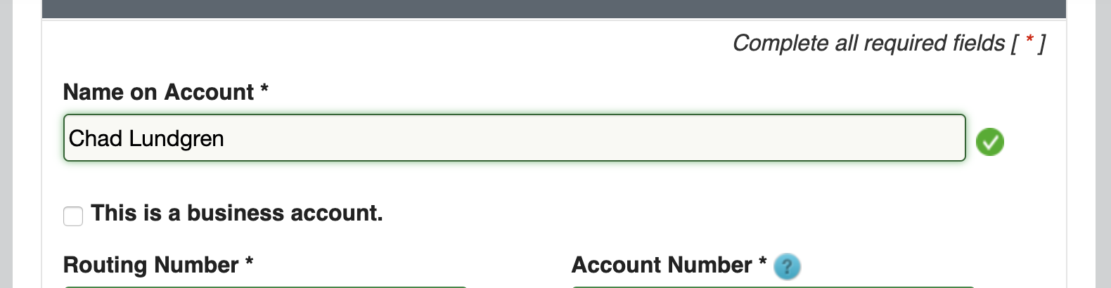
Then I notice the scroll bar. It has scrolled a section of the page past where I have to enter the name on the bank account. Sure, it is marked in red, but I can’t SEE that as it has helpfully been scrolled out of view. Also, it should really know my name already. Here is that hidden field, after I manually scroll up like some kind of animal and enter my name.

Showing the name field which the page scrolled past

Then and only then can I get to the confirmation screen. I have to accept the terms, again. I click on the checkbox, click Next, notice it is not working. I then see the red text saying (I’m paraphrasing here) “We are pedantic jerks, we are going to make you actually scroll to the bottom of the terms, which no one does, before we will let you check the box to show that you acknowledge them.”

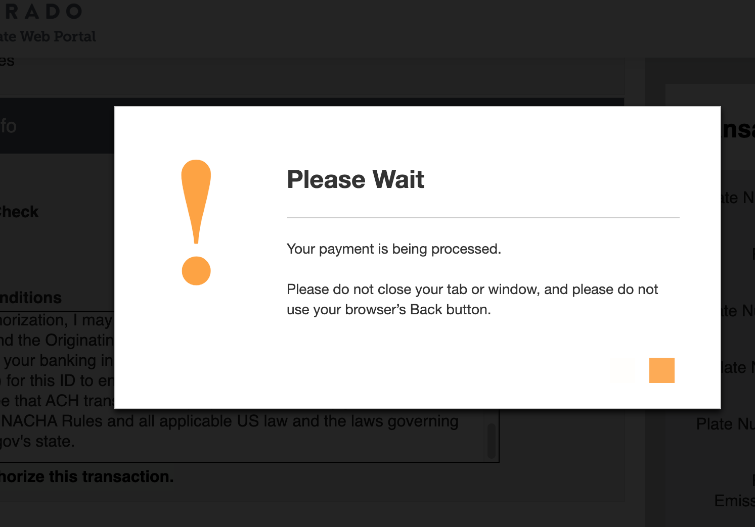
Then of course you get the “don’t you dare hit back or else we will charge you 19 times” popup window. I made my IQ roll on this one and cropped out the last four digits of my bank account. The sharp-eyed among you may be able to read part of those pesky terms.

Please wait popup window screenshot
Please wait, our programmers are t0o dumb to prevent double submissions

Why are government websites so head-desk levels of crap usability?

RTD Ecopass Usability Studied, Found Wanting

ecopass-reader-at-broadway-station

The good folks at my employer CommerceKitchen have set up its employees EcoPasses from RTD, aka the Regional Transportation District here in Denver. Since I recently moved to within walking distance of the light rail, I have only driven into work once in the last two months, and having a pass so I don’t have to think about it is both a money-saver. Having grown up in Albuquerque, I have a very long tolerance for traffic, so the light rail is a good fit. Overall, I like riding the light rail quite a bit.

However, the usability of the new RTD EcoPass, started in January of 2013, could be much better.  The first problem is that you have to scan your pass at all, which is a bummer when you’re trying to catch a train.

The screen is a larger version of those horrible 90s style LED screens last seen on crappy Casio watches that are hard to read in daylight, and the trip options of Local, Express and so on default to different settings depending on the station.  The buttons are the kind with horrible feedback, so even when you see the screen change, you feel like you haven’t pushed them.

I actively despise the EcoPass beep that happened when you scan your EcoPass. When it works, it makes a double fart. When it fails, it makes a single fart. I apologize to perfectly respectable farts everywhere for that slight. Both sound like scanning didn’t work.

ecopass-smart-card-message-wrongI had encountered the single fart noise once or twice before without realizing what it meant, but recently I was accosted by two RTD badge checkers who were loitering 15 feet behind the EcoPass scanner and informed me that the single beep meant that the pass had not registered.  There is a sign, as seen in this paragraph, that says to ‘wait for a beep.”

How am I supposed to know that when the message flashes up for only an instant, I asked? As someone who used to, in his misspent youth, blip through all 99 analog cable channels, I can register changes pretty fast.  After many tries, I have determined that the success message is ECOPASS 12/13/2013. Very helpful.

Getting back to the conversation, I pointed out how horrible it was, and with bad “you can’t make this up” customer service instincts, they told me to call the RTD Customer Service number.

Not really an update:  There is now a sign telling anyone who has problems to call this number now, lest one might think that suggestion is an anomaly.

My suggestions.

  • Make the success message display longer.  —  1 second would be an improvement. This should be cheap.
  • Fix the sign so it says two beeps.  Recently, of the three people that used an EcoPass to get on the train only one person (me) got it right – the other two got one beep.  I blame the system, not the people.
  • Make the screens more legible —  Probably not cheap, so never going to happen.
  • Make the buttons easier to push — See above.
  • Fix the software that crashed for 3 or 4 days at the Southmoor station, and 1 or 2 days at the Broadway station. I’m not holding my breath on this one.  See the “NOT INITIALIZED” image below.

ecopass-not-initializedFor the record, I have used the normal ticket system, and it’s nearly as bad. The screens are more legible, but then you get change in those dollar coins, which is very annoying, and the layout is wonky.

Nexus 7 Review

I recently purchased a 16GB Nexus 7.  My review so far:  awesome, a truly great gadget.

The plusses:

  • HD video from Netflix looks amazing. Youtube looks, well, like Youtube.
  • My Kindle books look great
  • Jellybean (the new Android Operating system) is very nice. Resizable widgets, notifications that are allowed to be longer, overall very polished.
  • It has serious hardware chops. It can run 3D games well, as well as HD video.
  • The form factor is very pleasing – it can be held with one hand
  • The screen uses Gorilla glass.  So far, it has survived a dog walking on it (pugs walk on couches, it turns out), a baby swiping at it (more on that in a moment) and still looks perfect
  • A $25.00 credit on the Google play is nice.
  • The baby (Matilda) loves the tablet. She likes a fractal program I downloaded, and a wallpaper program that lets you pick a solid color background. It’s hilarious to watch her swipe at the tablet – once she ended up on a page reviewing a local French restaurant, not sure how that happened.

Minuses:

  • Not that I care, but I could not read the free magazines when I first got them.  I deleted them, and then an hour later got a patch that basically said, make magazines work on a Nexus 7.
  • I didn’t expect to care about no 3G, but I went to a convention recently and ended up in the bar just to get WiFi since the meeting WiFi was not available.
  • When I first got the tablet (about a month ago) I could not use the home screen in landscape mode. This was annoying since it’s so nice to watch videos on. A recent patch fixed this.
  • I’m not a huge fan of not being to upgrade the SD card, which is part of the reason I picked the 16GB version of the Nexus rather than the 8GB version.
  • A few apps aren’t available on Jellybean yet – this will fix itself

New stuff after nearly two months usage:  I’m quite happy with the Nexus 7 still. I’m reading Kindle books (or Nook books more recently since the client is better), web surfing, and watching Netflix, as well as the usual Facebook/G+ and Twitter.  I had a scare with it not starting up but that turned out to be the wall outlet being funny. There are still some website out there that need to lose their Flash or proprietary video junk, but not many. (And I can use Firefox for Android with Flash installed if I really want to.)  I hardly ever use my laptop or desktop anymore.

Netflix: The Download Progress Bar is a Lie

Earlier this evening, I attempted to watch instant Netflix on my PS3. They been having problems lately, and on trying to watch a show, it got stuck in the middle of the download phase, clearly showing a download progress bar. I said, whatever, I’ll try back later when it’s less busy.

So here I am trying again, nearly 10:30PM local time, and it still doesn’t work. I notice that when I log in, I receive an annoying message saying I must go log in somewhere else, but logging in here seems to work. I’ve seen this before but ignored it.

I still can’t watch a show. It still gets stuck show the download progress bar. So finally I go out to the PS3 itself and re-re-login. Upon doing that it then informs me that I have to accept new Terms of Service. This is for the Playstation Network, not for Netflix. I do so, and guess what – it works fine, instantly even.

I don’t know if this is Netflix fault or Sony’s fault, but either way this is horrible usability: making it look like it’s working, showing me a download progress bar, producing a vague error message that sounds like it’s telling me to do what I just did (sign in), and making me accept Terms of Service for the second time in the last month or so.

Yes, that’s right, this happened before, just long enough for me to forget what the actual problem was. Horrible use of system status, unclear error messages, lack of memorability, they are really pulling out all the stops to violate as many usability heuristics as possible.

While I’m ranting, let me just mention that the newish PS3 Netflix client is a major downgrade. There are too many columns jammed in side by side, making it difficult to read the text. It also makes searching for a title very difficult: not all of the alphabet entry area is visible. If I had to hazard a guess as to why it’s built like that, I think they are assuming you’re on an HDTV. I’d like a downgrade to the old version, please.

Update: With the downing of the Playstation Network, I thought I’d completely lost the ability to use instant Netflix on the PS3. However, the same proceedure that failed before (trying to log in, then hitting the back button, doing this several times) works – for a while. Then you have to do it again.